NIKE COLOR DESIGN
STORYTELLING THROUGH COLOR
“As basic rules of a language must be practiced continually, and therefore are never fixed, so exercises toward distinct color effects never are done or over. New and different cases will be discovered time and again.” - Josef Albers
Perception of color is vital to understanding any environment. Hue, brightness, saturation, and tint all convey material information and provide a lens to interpret larger societal implications. Albers’ pioneering explorations in Interaction of Color exemplify the nuances of palette building. Not only does color provide critical visual feedback, considered palettes connect to a deeper cultural context. Color at its core is a powerful form of storytelling, capable of capturing relatable narratives and providing an opportunity for personal narratives to develop. My experience as a color designer at Nike allowed me to experiment with the intricacies of this medium and better understand its importance in an ever-changing global market. Color is often the determining factor in creating expressive or democratic options for a consumer and its relevancy most subject to change.
Note: Due to privacy constraints, my official Nike work is not available online. This project is a walkthrough intended to illustrate my process as a color designer and images are not affiliated with the company. If interested, I will provide documentation of my official work, send me a note: hello [at] hawnuhlee.com.
THE PROCESS
COLOR AS INSPIRATION
A recent trip to Iceland provided a dynamic range of color inspiration. Choosing strong imagery was representational of the adventure and the narrative platform to create correlating color swatches from.


COLOR AS NARRATIVE
As a color designer at Nike I spent a significant amount of time developing narratives around seasonal color direction. Final color and graphics application was informed through long, image-intensive research processes to craft innovative sports and lifestyle stories. The research process through multiple design iterations to final product development created informed storytelling methods that strengthened brand identity and consumer engagement.
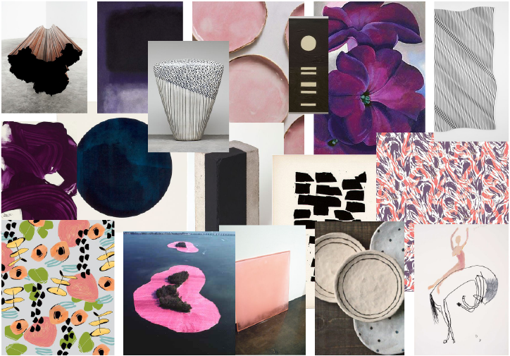
The following image boards are examples of visually relevant imagery based around a central theme to capture a certain aesthetic. Using an image board allows the designer to craft a well-informed narrative that influences the final product.


TOOLBOX
The application of color is indicative of the final narrative. A successful final product contextualizes the design research process and creates a more intimate consumer experience.
The following image boards are examples of effective color application ideas on footwear and apparel (images of existing product.)
BLOCKING

MATERIALS

GRAPHICS

An example of a recent color story narrative in market. This Air Max Zero is part of a larger energetic trail story. Color pops in the lace, airbag, and logo contrast with darker skin overlays and a midsole speckle to capture an athletic vibrancy.

Photo courtesy of hypebeast.com
Color is a universal visual language and a powerful tool for storytelling. I aim to implement thoughtful color executions across a wide range of media to create informed narratives and improve consumer engagement. My final applications rely on a thorough research process, multiple iterations of blocking and material experimentation, and diverse consumer feedback. The right palette application can create an accessible, democratic product and ultimately influence personal narratives of a larger generation.
(Note: This project is not affiliated with Nike.)